 |
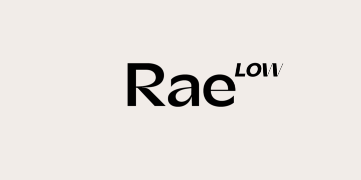
Rae Low is a low contrast sans serif typeface with strong roots in German typography. Inspirit by 19th century store and street signs, Rae Low is a homage to a traditional craft which is deeply grounded in functionality.
By combining low contrast with high contrast letterforms and deep ink traps which all got pushed to the maximum, we created a truly futuristic typeface.
Rae Low works well as display typeface, but also can create interesting body copy.